

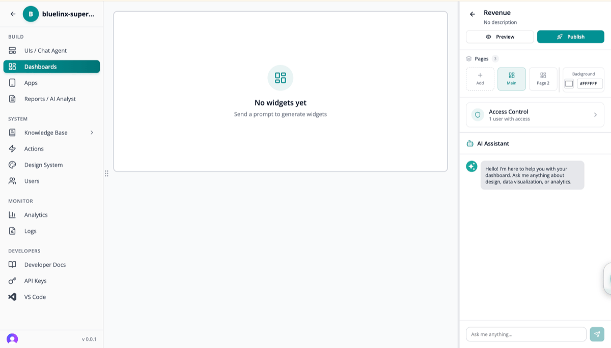
Dashboards Overview
View all available dashboards and create new ones: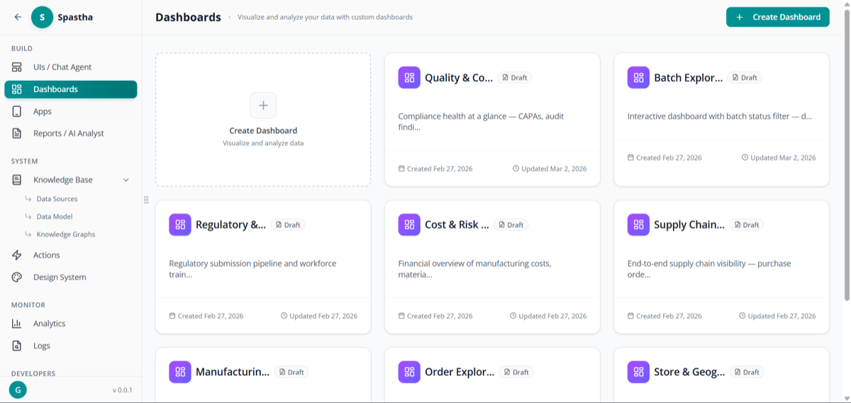
Dashboards list — view and create dashboards
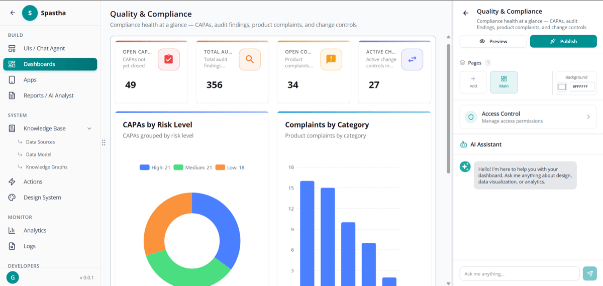
Dashboard detail view with widgets
Creating a Dashboard
1
Navigate to Dashboards
Click Dashboards in the sidebar under BUILD
2
Click Create Dashboard
Start with a blank canvas
3
Add Components
- Ask questions in natural language, or
- Add from bookmarks, or
- Drag from component library
4
Arrange Layout
Drag and resize components to create your layout
5
Save & Share
Name your dashboard and set permissions
Dashboard Components
From Natural Language
Type a question directly in the dashboard:- Click + Add Component
- Type your question: “Revenue by region this quarter”
- Superatom generates the visualization
- Resize and position as needed
From Bookmarks
Reuse visualizations you’ve already created:- Click + Add from Bookmarks
- Select from your saved visualizations
- Component added with same configuration
Component Types
KPI Cards
Single metrics with trend indicators
Charts
Bar, line, pie, scatter, and more
Tables
Detailed data grids
Maps
Geographic visualizations
Filters
Interactive data filters
Text
Headers, descriptions, notes
Layout & Design
Grid System
Dashboards use a flexible grid:- 12 columns for precise positioning
- Auto-resize components to fit
- Snap-to-grid for alignment
- Responsive for different screen sizes
Sizing Options
Themes
Choose from built-in themes or customize:- Light mode
- Dark mode
- Custom brand colors
Interactive Features
Filtering System
Dashboards support a layered filtering system that gives users precise control over what data is displayed.Global Filters
Affect all tiles simultaneously:- Date Range — Filter entire dashboard by time period
- Region — Show data for specific regions
- Product — Focus on product categories
- Custom — Any dimension in your data
Tile-Level Filters
Individual tiles can have their own filter overrides that narrow or modify the global filter scope. For example, a global filter set to “All Regions” can be overridden on a specific tile to show only “Northeast” for a focused comparison.Cross-Filtering
Click a data point in one tile to filter related tiles:- Click “Northeast” on a regional bar chart — all other tiles filter to Northeast data
- Click “Q3” on a timeline — all tiles narrow to Q3
- Click a product category — see its impact across all metrics
Filter Persistence
Filter selections are saved with the dashboard. When users return, they see their last-applied filters. Shared dashboards preserve the creator’s default filters, while each viewer can apply their own overrides without affecting others.URL Parameters
Filters can be set via URL parameters, enabling direct links to specific filtered views:Drill-Down
Click any data point to:- See underlying details
- Open related visualizations
- Ask follow-up questions
Auto-Refresh
Keep dashboards current:Sharing & Permissions
Access Levels
Sharing Options
- Specific Users — By email or username
- Roles — All users with a role
- Public — Anyone with the link (optional)
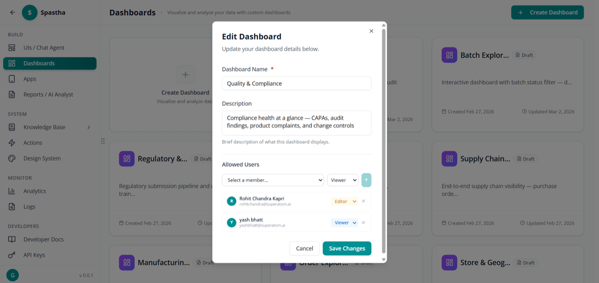
Edit dashboard permissions
Embedding
Embed dashboards in other applications:- Iframe embed code
- Authenticated embedding
- Custom domain support
Dashboard Templates
Start faster with templates:Executive Overview
KPIs, revenue, orders, customer metrics
Sales Performance
Pipeline, win rates, rep performance
Inventory Health
Stock levels, turnover, alerts
Financial Summary
Revenue, margins, cash flow
Best Practices
Keep It Focused
Keep It Focused
One dashboard = one purpose. Don’t try to show everything.
Prioritize Top-Left
Prioritize Top-Left
Most important metrics go top-left (where eyes start).
Use Consistent Sizing
Use Consistent Sizing
Similar components should be similar sizes.
Add Context
Add Context
Include titles, descriptions, and time periods.
Next Steps
Reports
Schedule dashboard delivery
Mobile Apps
Access dashboards on mobile